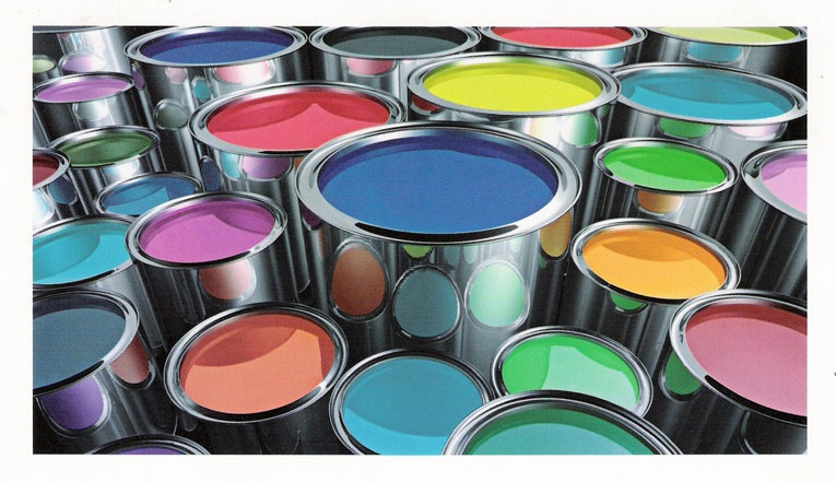
 It’s that time. Time for me to choose a color for the walls in my writing area. We actually have a pretty colorful home. When we moved in, the entire downstairs was off white and the upstairs, minus the rooms, was brownish. Like coffee with too much cream and sugar. Old coffee that’s sat in a cup too long and tastes like it looks. I digress. We tackled the rooms first. Each child wanted their own color. After those dreams were semi-dashed, we compromised and chose something more reasonable than black or metallic. The smaller boys got blue. Like a medium denim, with a tan ceiling. It looks rather nice. Tidy and uniform; when I go in there I feel at ease. My oldest wanted purple, it’s his favorite color. It took forever to find the right one. Not too pale, not too medieval dark. It reminds me of eggplant. When I go in there it shrouds me. Does that even make sense? I don’t feel oppressed, it just makes me feel like I’m cloaked in purple. It’s better than what it makes me feel. Really.
My second oldest son didn’t care. He’s like that. Whatever, just leave it void of color if we wanted. But, I knew green was his favorite, so I went with a nice pasture looking green. Nothing lime, nothing mossy, just a clean green. Like you’d see in Colonial Williamsburg. Now, for my daughter. I only have one, so when she was a baby, I really laid on the pink. Four boys and one girl. I loved the notion of everything pearls and lace, frilly and dainty. But, no. Sorry, this girl wanted orange. Not just any orange. Neon, sunglass-wearing to cope going into her room, orange. After ten or so paint tester cans of lavender, yellow, raspberry, sky blue…we finally found a peach that suited us all. When I go into her room I feel happy. It’s amazing how the color picks me right up from whatever I was feeling just a few steps away from her doorway.
Our kitchen is blue, our dining room is red, and our living room is green. Trust me, we did research and color coordinated our choice of fabric in all the living spaces. It flows well and our family and visitors seem to like it.
When it came time for my bedroom I wanted something soothing, something that caused me to feel relaxed. It’s amazing how colors are used in marketing to bring about emotions of people. I wanted cool and pleasurable before shutting my eyes for the night. We went with a somewhat bird egg blue. It gives the sense of clean, fresh linen. Soothing waters. I’m really pleased with it. And, I painted it myself, so I’m exceptionally proud of how it turned out.
Now, to the task of my writing area. It flows into my sewing area. I guess I “work” in both, so I don’t want too much relaxation going on, but then again I don’t want to feel a blood pressure spike of happy dappy yellow. They say red stimulates the mind and body and helps in circulation, but I don’t want to feel like at any moment Ronald McDonald is going to come in and hand me a cheeseburger. Orange is said to increase energy levels and I do feel oddly happy when I go into my daughter’s room. Blue is too relaxing and white just isn’t an option. So, it’s settled, I think I’ll do something between an orange and a pink. If my little girl refuses to embrace the pink, I just might have to incorporate it into my world. I’ll tackle the old coffee hallway another day!


